Monitoring & Insights
One of the most powerful features of UpgradeMate is its Power BI dashboard, designed specifically for the UpgradeMate architecture. This guide gives you a tour of the dashboard layout, walks through how to track scans and upgrades, and shows how to drill down to the details of a single machine.
Video Tutorial
Requirements
- The Power BI Dashboard Setup must be complete and the scheduled refresh plan must be running so the dashboard reflects current data.
Step-by-Step Guide
Dashboard Layout
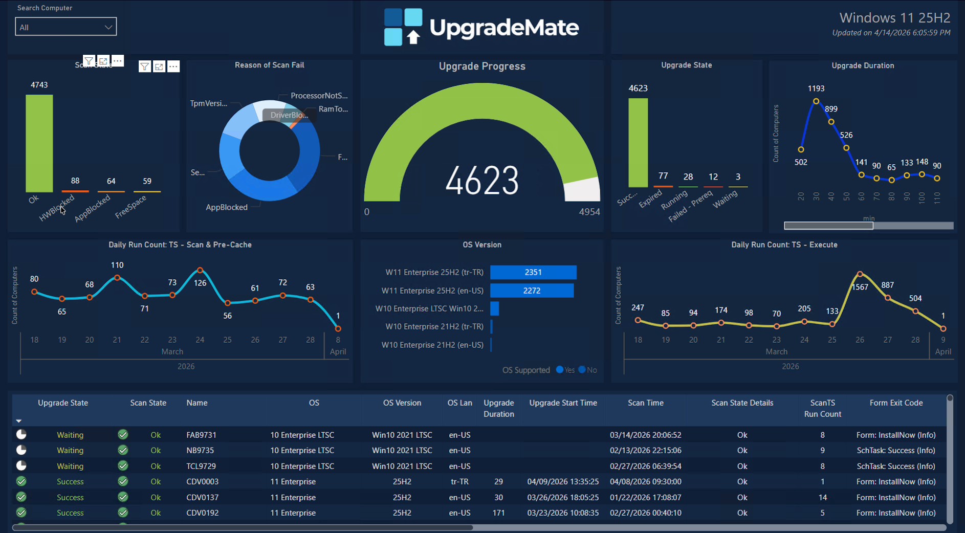
The dashboard is laid out in four logical areas: the Scan section on the left, the Overall progress tracking in the middle, the Upgrade section on the right, and a Details table at the bottom that updates as you interact with the charts.
The dashboard is organised into the following panels. Every chart is interactive — clicking on a slice or bar filters the rest of the dashboard to that selection. The dashboard is composed of four sections:
- Scan section
- Scan State — counts of devices grouped by scan outcome.
- Reason of Scan Fail — breakdown of why scans failed (TPM version, RAM too low, processor not supported, secure boot, etc.).
- Daily Run Count: TS — Scan & Pre-Cache — how many machines hit the scan task sequence each day.
- Upgrade section
- Upgrade State — counts of devices grouped by upgrade outcome.
- Upgrade Duration — how many devices completed the upgrade in each duration bucket (in minutes).
- Daily Run Count: TS — Execute — how many machines hit the execute task sequence each day.
- Overall progress tracking
- Upgrade Progress — gauge showing devices upgraded out of the total candidate pool.
- OS Version — counts of devices by current operating system version, with a flag for whether the OS is supported.
- Details table (bottom) — per-device rows showing name, OS, OS version, language, upgrade duration, scan time, scan state details, run counts and form exit codes.
- Scan section
The Search Computer dropdown in the top-left corner lets you filter the entire dashboard down to one or more specific computers. The Updated on timestamp in the top-right shows when the data was last refreshed by the scheduled refresh plan.
Tracking Scans and Resolving Errors
The Scan State chart shows the totals for each scan outcome — for example, 4,743 devices scanned successfully and additional buckets for HWBlocked, AppBlocked and FreeSpace failures.
Click any failure bucket on Scan State (for example
HWBlocked) to filter the dashboard down to those devices. The Reason of Scan Fail chart then shows why those scans failed and the details table at the bottom lists each device with its specific failure reason.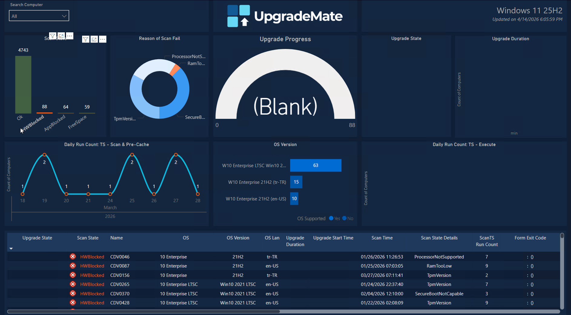
The Daily Run Count: TS — Scan & Pre-Cache chart at the bottom of the scan section shows how many machines were scanned each day. Use it to confirm that the scan task sequence is running on the schedule you configured.
Tracking the Upgrade Stage
Once devices pass the scan, they move into the upgrade stage. The right side of the dashboard tracks how many users have completed the installation and how long the upgrade is taking.
The Upgrade Progress gauge in the centre of the dashboard is the main tracking widget. It shows the number of devices that have completed the upgrade out of the total candidate pool (for example, 4,623 of 4,954 machines). Click any segment of the gauge or the OS Version bars to filter the rest of the dashboard.
The Upgrade State chart breaks down outcomes into
Success,Expired(the days-to-force-upgrade window ended without action),Running,Failed-PrereqandWaiting. There are also panels for forced installations versus user-initiated ones.The Upgrade Duration chart shows how many machines completed the install in each duration bucket — for example, 1,193 machines finished within 30 minutes. Use it to spot devices that take significantly longer than the median.
The Daily Run Count: TS — Execute chart shows how many machines started the upgrade each day, so you can confirm the form deployment cadence is producing the volume of installs you expect.
Drilling Into a Single Machine
For root-cause analysis on a specific device, use the Search Computer dropdown to filter the entire dashboard down to that machine. Every chart and the details table then refresh to show only that device.
Open the Search Computer dropdown in the top-left and select the device you want to inspect (for example,
CDV0003). The dashboard now shows the upgrade journey for that single machine.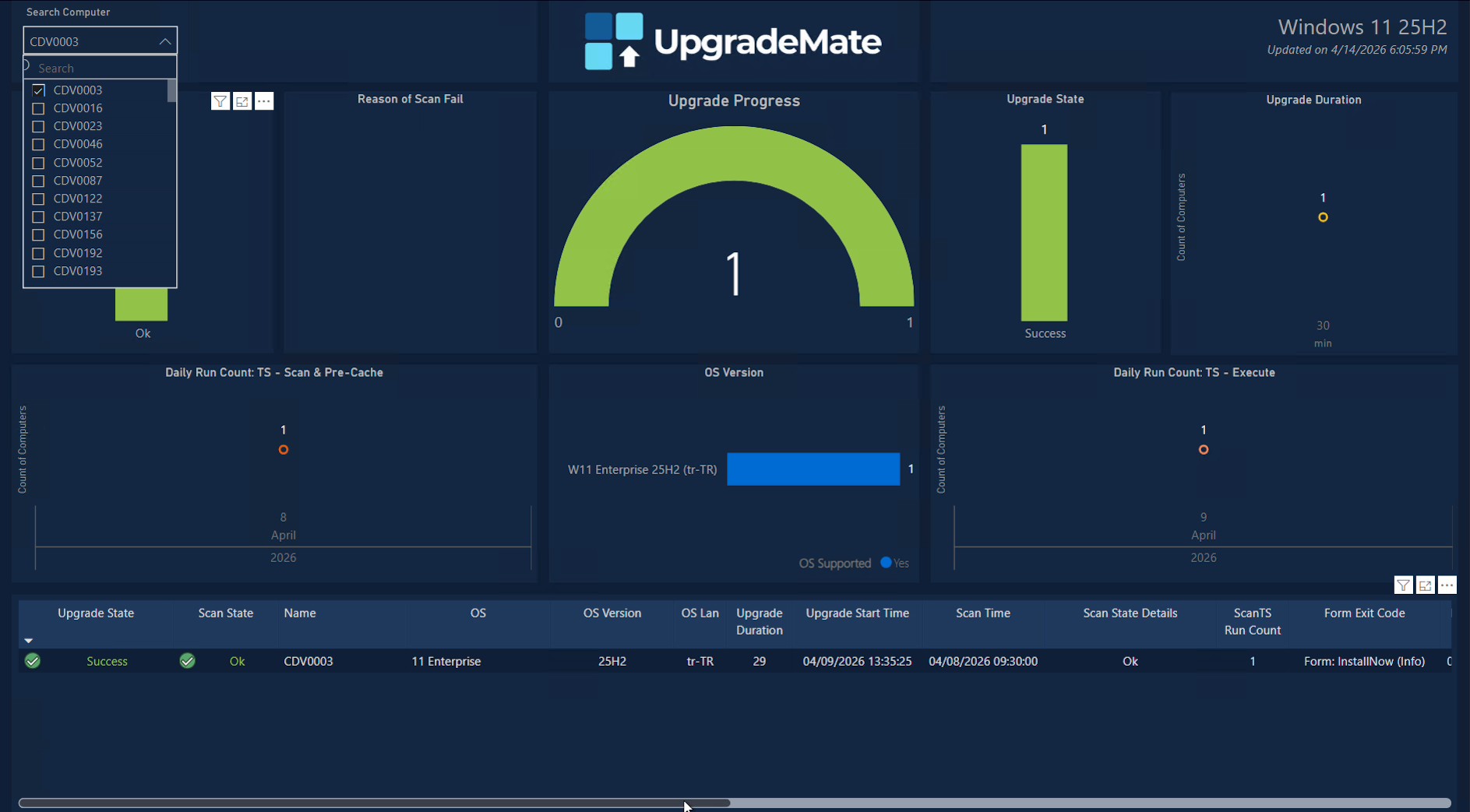
For the selected machine you can read the full timeline at a glance:
- When the scan was completed (Scan Time) and its result.
- When the upgrade started (Upgrade Start Time) and how long it took (Upgrade Duration).
- The dates on the Daily Run Count charts show exactly which days the scan and execute task sequences ran.
Scroll the details table to the right for additional per-device columns: form interaction counters, hardware and OS detail, and the user that last logged on.

- Form Notification Count — how many times the form was shown to the user.
- InstallBtn / ScheduleBtn / PostponeBtn Click Count — how many times the user clicked each option.
- Form Last RunTime and Form Notification End Time — the most recent form interaction and the end of the days-to-force-upgrade window.
- On — whether the device is currently online.
- FreeSpace (GB), OS Build, PreOS Build, OS Lang, LogonUser, AD Site, Manufacturer — environmental and hardware context for diagnostics.
The Power BI dashboard is your single source of truth for the upgrade campaign — from fleet-level progress all the way down to a single user’s form interactions.